The story in brief
Canva’s latest controls offer a useful product-design question for founders: what should remain possible when a customer chooses a different way to work? Examine the setting, the promise it makes and the journey that follows.
Source starting point: Canva: Introducing AI Controls: Your creativity, your call — announcement dated 19 November 2026; checked 20 November ↗. Full sources and context appear below.
What Canva announced
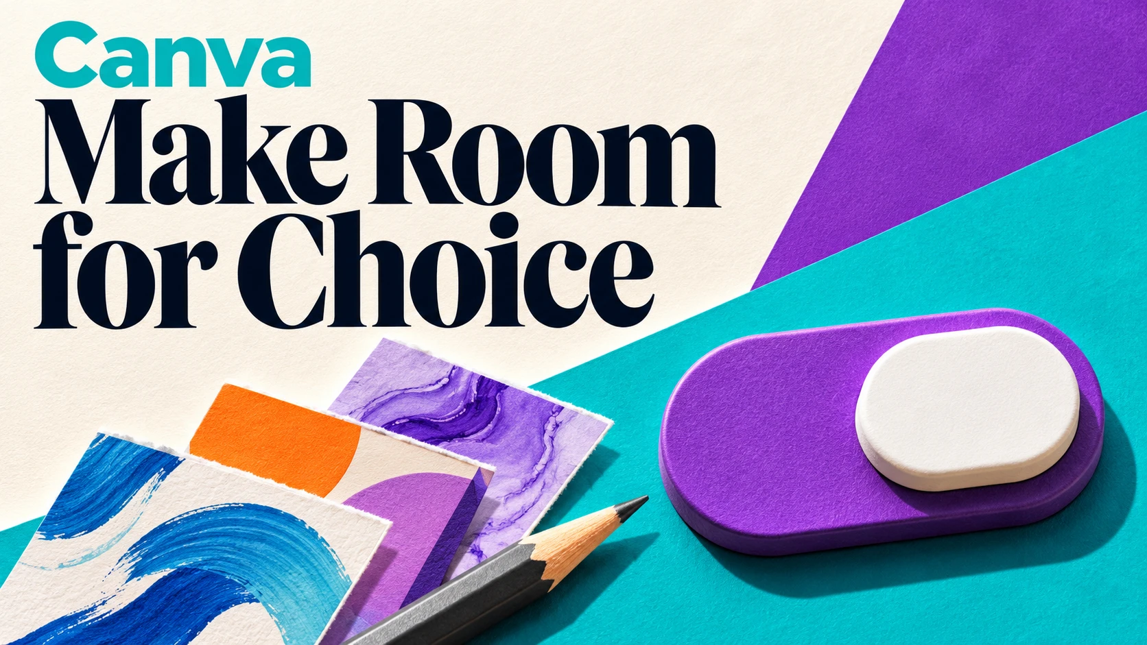
On 19 November 2026, Canva announced two controls for Free and Pro accounts at no additional charge. One hides generative AI features when disabled and can be reversed. The other reduces AI-generated material in library search and recommendations, without altering existing designs. Canva says assistive tools such as Background Remover remain available.
The company places the feature switch under Profile → Settings → Permissions and the content preference under Profile → Your account → AI Personalization. Its wording matters: fewer AI-generated results is a narrower promise than eliminating them. The announcement also distinguishes these personal controls from existing organisational admin permissions.
Put the new decision in its proper context
This arrives after Canva’s 29 October 2026 introduction of Brush, a model for editing designs from prompts. That earlier announcement described supported edits for Pro subscribers, with broader availability planned. It is historical context for this article, not another launch today or evidence that the promised expansion has happened.
Our reading is that adding capability and making its use optional can be complementary product decisions. A founder does not have to infer a reversal of strategy from a new setting. Equally, an announcement alone cannot establish that customers will feel more confident, stay longer or buy more. Those are questions for subsequent evidence.
Define the promise before drawing the switch
For your own product, begin with a sentence a customer can understand: when this preference changes, these actions change and this work remains possible. Write that sentence before deciding where the toggle belongs. It will expose whether the setting controls a tool, a recommendation, a stored item or something else.
Consider a fictional invoicing startup that offers automatically drafted payment reminders. A customer may want help writing a message but still want to approve each send. Another may prefer writing from scratch while retaining scheduled delivery. A single automation switch could blur two separate decisions.
Map the choices to the jobs customers describe. Then ask a person unfamiliar with the design what they expect each setting to do. Record the prediction before showing the result. A mismatch is useful evidence that the wording or behaviour needs work, even if the interface looks tidy.
Test whether the alternative journey still works
Choose a concrete task and complete it with the optional feature turned off. In the invoicing example, that means creating a reminder, reviewing its recipient and amount, sending it at the intended time and finding the sent record. The alternative route should be evaluated as a complete customer journey.
Look for invitations to use an unavailable feature, missing instructions and dead ends. A button can disappear while the surrounding help still assumes it exists. Also examine what happens when a customer returns to a saved draft or changes devices. Do they understand the current state without repeating the setup?
This is a recommendation for testing your own implementation, not a claim about defects in Canva. Start with a small set of representative tasks. If maintaining two routes would stretch the team beyond what it can reliably support, narrow the feature’s scope and explain that scope plainly before expanding it.
Measure successful work alongside feature adoption
A dashboard that celebrates only use of the newest feature cannot tell you whether the product serves people who decline it. Define a task outcome that applies to both routes: an approved reminder sent correctly, for example, rather than a generated draft created.
Compare completion, corrections, time spent resolving confusion and support questions. Keep the groups and observation period explicit. Customers who opt out may have different needs or experience, so a difference between groups is not automatically an effect caused by the setting. Interview people about their reasons before drawing a causal conclusion.
Treat returning to a previous preference as information, too. A customer may experiment, discover a poor fit for one task and try again later. Decide what evidence would justify changing the default, simplifying the explanation or keeping the choice as it is. Avoid interpreting every unused capability as a failure of onboarding.
Make the boundary easy to explain
Ask support, product and sales colleagues to describe the same setting independently. If their answers differ, resolve the discrepancy in the product and its documentation. A customer should not receive a broader promise from a sales conversation than the interface can honour.
For the fictional reminder tool, document whether changing the preference affects drafts already created, scheduled messages or only future work. Show a clear confirmation when the choice takes effect and make the route back understandable. Test the boundary cases before publishing the feature description.
The useful founder lesson from this company spotlight is to give optionality an owner. Someone should be responsible for the quality of each supported journey, the accuracy of the explanation and the evidence used to revise it. A choice earns its place through the work it helps customers complete.
Audit one optional feature
Use these questions to investigate the idea in your own context.
- Write the exact change a customer should expect when choosing an alternative.
- Separate choices that serve different customer intentions.
- Complete one representative task through each supported route.
- Check saved work, help text and the path back to the previous setting.
- Choose a shared task outcome and review confusion before changing defaults.
A closer look
Is this a hands-on review?
No. It combines primary-source reporting with Founderline’s original product evaluation framework. We have not independently tested availability or behaviour.
Does the article establish a commercial benefit for Canva?
No. It does not report a measured effect on retention, revenue or customer satisfaction.
What is the first useful test for a small team?
Ask a customer to predict what one setting changes, then observe whether the resulting journey matches that expectation.
Sources & editorial note
Source-based company coverage researched on 20 November 2026. The new announcement is dated 19 November; the October product reference is earlier context. Founderline has not tested the controls. The evaluation framework and fictional example below are our analysis, not measured Canva outcomes or a company endorsement.
- Canva: Introducing AI Controls: Your creativity, your call — announcement dated 19 November 2026; checked 20 November
- Canva: Introducing Canva Brush — earlier announcement dated 29 October 2026; checked 20 November
- Canva Newsroom: announcement chronology — checked 20 November 2026
See our editorial standards or request a correction. For a useful comparison, read Freshworks’ standalone ITAM offer: a lesson in fitting the customer’s existing stack. Explore the founder topic guides for connected reading paths.